
Abstract
As 5G wireless communication technology is currently deployed, an increasing amount of data is available from mobile devices out in the field. Exploiting this data, also called system traces, recent investigations show the potential to improve the wireless modem design and performance using data-centric approaches. Such data-centric workflows are exploratory and iterative by nature. For instance, time pattern identification is performed by domain experts to derive assumptions on potential optimizations and these assumptions are continuously refined during multiple iterations of data collection, visualization and exploration. In this context, we propose three optimizations to increase the exploration speed in iterative data-centric workflows. First, we present a methodology based on persistent memoization in order to minimize the data processing duration when additional event sequences need to be extracted from a trace. We show that up to 84.5% of the event extraction time can be spared for a typical modem trace data set. Secondly, we present a novel entropy-based data interaction technique for visual exploration of event sequences and finally, a similarity measure to perform subsequence matching in order to assist the user when identifying frequent time patterns in a trace.
You have full access to this open access chapter, Download conference paper PDF
Keywords
- Exploratory workflow
- Iterative feature extraction
- Workflow optimization
- Time-oriented data visualization
- Visual interaction
- Zoom+Slant
- Event sequence similarity measure
- Categorical event sequence
1 Introduction
The increasing number of mobile devices out in the field generates a colossal amount of data that can be used to optimize the design and behavior of existing and future devices. As opposed to simulation-centric approaches, such data-centric approaches allow to improve key performance indicators (KPIs) with respect to the user context or behavior. For instance, a low priority data transfer to the network might be delayed if the congestion of the network is expected to be high at a specific time of the day or in a specific location. However, collecting data from mobile devices, also called traces, often requires many efforts, e.g., implementing the tracing system or manually collecting traces at different locations. Usually, a maximum amount of hardware and software events is recorded to ensure that the required information is present in the trace in case additional analyses are needed. Because of embedded storage requirements, the raw trace is therefore drastically compressed.
Using such raw traces as input, data-centric workflows, e.g., machine learning workflows [1], often include three steps, as depicted in Fig. 1. In the following, we provide a description of these three steps with related examples for modem power optimization:

Exploratory and iterative workflow for modem trace data analysis.
-
1.
Trace processing. In order to extract meaningful event sequences from a raw trace, computer processing time is required. This extraction usually consists in data decompression, aggregation and sampling.
Example: In the context of modem power optimization, power-related event sequences are extracted as well as event sequences representing the size of the data packets that are exchanged with the network at different timestamps.
-
2.
Visual exploration. The analysis typically starts with a visual exploration of the event sequences. The goal is to identify potential optimizations and discuss them with domain experts.
Example : Periods of high power consumption for specific components are identified.
-
3.
Relevance estimation. Once a time pattern of interest is identified, the relevance of the proposed optimization is assessed, typically by finding a representative amount of similar patterns in the trace.
Example : A time correlation between high power consumption periods and a specific data packet time pattern is identified.
Finally, such workflows are iterative and exploratory by nature, as relevant optimization proposals often raise questions that can be answered by a new iteration of event sequence extraction and exploration.
-
Example : An additional event sequence representing the status of the data buffer is extracted. From a domain expert point of view, a high data buffer usage due to specific data packet patterns can lead to a high power consumption. In this case, optimizing the power consumption consists in a modification of the buffer size.
In essence, we argue that optimizing the human-computer interactivity in such iterative data-centric workflows relies on data processing time reduction, human exploration time reduction and analysis time reduction. Therefore, in this paper, we propose three optimizations to increase the exploration speed and improve the interactivity in such workflows. First, in Sect. 2, we present a methodology to minimize the data pre-processing duration in each iteration. Secondly, in Sect. 3, we propose a novel entropy-based data interaction technique for event sequence visual exploration. Finally, in Sect. 4, we evaluate a similarity measure to perform subsequence matching in order to identify frequent modem behaviors.
2 Iterative Trace Processing
A modem trace of a LTE/5G device typically contains information reaching 250 MB of hardware and software events logged during 2 min. Due to embedded storage requirements, this information needs to be drastically compressed and a significant amount of pre-processing time is needed to extract and combine the raw data into meaningful event sequences (around 10 min for 100 event sequences).
Basically, these event sequences are used as input data for many tasks such as verification, system level optimization or machine learning. In most of the cases, these tasks require multiple iterations of trace preprocessing. For instance, a verification engineer would inspect a set of event sequences to derive some assumptions on the root cause of an anomaly. To refine these assumptions, additional sets of event sequences need to be extracted in order to finally identify the root cause. Similarly, in a machine learning workflow, the initial set of event sequences might be iteratively expanded to add new features that might improve the model performance. Even at early visualization stages, the observation of an event sequence leads to questions that can be answered by observing other event sequences, e.g., identifying causality between event occurrences.
In essence, we argue that such iterative workflows often require multiple iterations of trace processing. However, there are some cases where extracting all event sequences at once is more efficient than iteratively extracting them only when needed, i.e., on-the-fly extraction. Concretely, on-the-fly event sequence extraction is desirable if one of the following conditions is fulfilled: (1) the set of required event sequences can grow and is not fixed at the beginning of the workflow, (2) extracting every possible event sequence leads to high disk space usage, or (3) trace processing duration needs to be minimized. If none of these requirements is necessary, then extracting all event sequences at once is sufficient. In our case, the requirement 2 is desirable since typical data sets could contain around 1000 traces of 2 min, leading therefore to more than 250 GB of raw data. Finally, requirements 1 and 3 are entirely fulfilled since the set of event sequences in iterative workflows is not fixed and minimizing the trace processing time is crucial for the interactivity of such iterative workflows. Therefore, on-the-fly event sequence extraction is desirable in our case.
In the following subsections, we describe our proposal to minimize iterative trace processing time. Firstly, we define the event sequence extraction as data flow graph and describe our optimization proposal: applying persistent memoization to each node of the data flow graph. In essence, we propose to persist results of redundant and time-consuming computations in order to re-use them if they are needed during a new workflow iteration. Secondly, we present the structure of the data flow graph for modem trace processing and thirdly, we provide a trace processing timing analysis.
2.1 Data Flow Graph and Persistent Memoization
The trace processing steps can be represented by a directed acyclic graph called data flow graph (DFG) where nodes are data transformations, i.e., functions, and directed edges represent intermediate data produced and consumed by the nodes, i.e., variables [2]. In Fig. 2, we present an exemplary DFG with its associated nomenclature.

Exemplary data flow graph. A node represents a function that produces only one output variable and consumes variables produced by one or multiple nodes. Therefore, edges starting from the same node represent the same data, but edges ending at the same node represent different data. For instance, the node \( n_{1} \) produces the variable \( x \) which is consumed by the nodes \( n_{2} \) and \( n_{3} \). The node \( n_{4} \) consumes both variables \( y \) and \( z \). The blue subgraph denotes processing steps already executed during the previous iteration whereas the red subgraph denotes additional processing steps executed during the current iteration. Black nodes are not executed yet. (Color figure online)
In Fig. 2, if the variables \( x \) and \( z \), produced during the previous iteration (blue subgraph), are persisted, i.e., saved to the disk, they can be retrieved and used during the current iteration (red subgraph). For time-consuming node executions, retrieving intermediate variable is often profitable. However, for fast node executions, the time required to save and load variables might be longer and therefore, intermediate result persistency is not optimal.
Variable persistency could be easily achieved by assigning unique names to files containing persisted variables. If the file exists, the variable could be directly retrieved. However, when designing a DFG for data processing, adjustments of the code often need to be done across multiple iterations, e.g., bug fixing, code cleaning, etc. Therefore, some nodes of the DFG are often modified between two iterations. This leads to modifications of some output variables and possibly all output variables of the child nodes. In this case, saving the node output in a file and checking the file existence is not sufficient to decide whether a result should be retrieved or not. Essentially, avoiding node re-computation only if the node and its input variables remain unchanged can be achieved by memoization [3]. Memoization is often implemented by caching the intermediate variables to the system memory. However, as described in [3], these variables could be persisted, i.e., stored to the disk, in order to be retrieved even across multiple program launches. Therefore, we propose to apply persistent memoization to each node of a data processing DFG in order to avoid unnecessary re-computations.
In order to check whether a variable changed, every time an output variable is produced by a node, it is persisted together with its hash, typically a 128-bit or 160-bit hash value. The more the hashing function is complex, the lower the chances of hash collisions are. However, complex hashing function also take more time. Therefore, we chose simple hashing functions like MD5 or SHA-1. The probability of hash collision of two variables is still less than 1 over 1018. To decide whether a node needs to be re-computed or not, the hashes of the input variables and the hash of the node code is compared with the corresponding hash values stored during the previous execution. If they differ, then we can conclude that either the input variables or the node code have changed. In this case, the node is re-computed. Otherwise, nothing is done and we can ensure that the output variable is up-to-date. Checking the mentioned hashes and eventually re-computing a node is defined as node evaluation.
Depending on the results requested, some nodes of the DFG do not need to be evaluated, e.g., in Fig. 2, the node \( n_{5} \) is not evaluated because the result of \( n_{4} \) only is requested and does not depend on \( n_{5} \). Given the entire DFG, defined as \( G \), we also define as evaluated subgraph \( G_{{\{ x,z\} }} \), the subgraph composed by the nodes and all parent nodes producing the output variables \( x \) and \( z \). To obtain these variables, we evaluate each node in \( G_{{\{ x,z\} }} \) following their topological order.
2.2 Modem Trace Processing
In the context of modem trace processing, defining the computations as a DFG with persistent memoization is well suited because of the architecture of the tracing system. Usually, the formats of the trace messages logged from two sub-components belonging to the same sub-system have some common semantics. For instance, the sub-component timings will rely on the clock of the sub-system and, therefore, their timeframe will have the same semantics. In Fig. 3, we present the DFG structure for modem trace processing. In the depicted FDG, a node from layer \( B \) is typically responsible to extract and retrieve the clock information for a specific sub-system.

Data flow graph for modem trace processing. Following the notation of Fig. 2, the blue subgraph denotes node evaluations performed during the previous iteration and the red subgraph denotes additional node evaluations performed during the current iteration. The nodes in the lower layer, i.e., layer \( D \), produce the meaningful event sequences. They are fed by standardized HW/SW modem events produced by layer \( C \) nodes. Layer \( B \) nodes produce sub-system-specific data and the node in layer \( A \) is responsible to import the compressed raw data into the language-specific data structure. (Color figure online)
2.3 Results
In the following, we provide specific trace processing timings recorded for a data set of 20 traces of around 100 MB.
First, the size of the variables produced by the nodes typically does not exceed 10 MB. Therefore, the time required to save a variable and compute its hash, evaluated on a standard computer, typically does not exceed 250 ms. In comparison, the averaged node processing time is 82 s for the layer \( A \) node, 11 s for layer \( B \) nodes, 3.4 s for layer \( C \) nodes and 1.2 s for layer \( D \) nodes.
Secondly, we evaluate the iteration processing time by extracting 5 additional event sequences for each trace processing iteration. We perform 19 iterations which finally result in a total of 95 event sequences. In Fig. 4, we compare the processing time between the standard sequence extraction without persistent memoization and our proposed memoized sequence extraction.

Time required to iteratively extract 95 event sequences. In each iteration, 5 additional random event sequences are extracted. The timing of each trace processing iteration is evaluated on a data set containing 20 raw traces (100 MB) for both standard processing (without persistent memoization) and optimized processing (with persistent memoization).
We can observe that the first iteration takes a few more seconds for the memoized trace processing compared to the standard one. This is additional overhead is due to data saving and hashing. However, for the next iterations, we notice that up to 84.5% of the processing time duration can be saved. This processing time optimization is crucial when interacting with a trace data set, e.g., in order to iteratively observe additional event sequences or to obtain fast results for a small set of event sequences.
3 Entropy-Based Visual Data Interaction
Visual exploration of a trace is a key step for many workflows. When dealing with a modem trace, an efficient visual representation and data interaction mechanism allow to rapidly navigate between key events in order to better understand what is happening in the trace. For instance, a verification engineer needs to check that the connection between the mobile device and the network is well set up, maintained and closed properly. These mechanisms are constantly signaled in the modem trace by events occurring throughout the data exchange. If some anomalies are detected, additional event occurrences from other sub-components need to be visualized, in order to locate the root cause of the anomaly. In general, trace visual exploration helps to understand the behavior of a system in order to detect anomalies, identify possible optimizations or even to ensure that tracing or trace processing is performed correctly. In machine workflows, a predictive model might achieve bad accuracy on one trace compared to the accuracy achieved on the entire data set. In such cases, visually exploring the trace with domain experts is a crucial step to improve the accuracy of such outliers. In these workflows, the interactivity highly depends on the ease of visual exploration of event sequences. Therefore, we propose a data interaction mechanism, which we also called slanting, that allows to vary the amount of information presented to the domain expert without losing crucial patterns such as temporal periodicity.
In the following subsections, we first formalize the notion of event sequence and describe the visual representation chosen for trace event sequences. Secondly, we perform a literature review of popular interaction techniques for time-oriented data. Finally, we describe our proposed slanting mechanism and perform a computational complexity analysis of the slanting algorithm.
3.1 Event Sequences
Definition.
Let \( \left\{ {e_{t} } \right\}_{t = 1}^{T} \) be an event sequence with a total number of \( T \) timestamps (typically \( T \approx 2.10^{5} \)) such that \( e_{t} \in {\mathcal{H}}\mathop \cup \nolimits \left\{ {\text{NULL}} \right\} \), where \( e_{t} \leftarrow {\text{NULL}} \) indicates no event occurrence at timestamp \( t \) and \( {\mathcal{H}} = \left\{ {a_{1} , \ldots , a_{H} } \right\} \subset {\mathbb{R}} \) is a finite set of possibly unordered real symbols.
Representation.
Typically, for visual exploration of a trace, over a hundred event sequences might be observed simultaneously along the same time axis. For instance, in the DFG of Fig. 3, more than 50 different event sequences might be extracted to be observed together. We propose to use the lasagna representation [4]. It is well suited to explore juxtaposition of dozens of event sequences (at most hundreds) as it encodes values in colors using a small and constant amount of vertical space. Essentially, each event sequence is represented as a layer through time and can have its independent color coding. In Fig. 5, we depict a lasagna representation of event sequences from an exemplary modem trace.

Modem trace chunk of length 2600 ms containing 8 event sequences. The white color always denotes no event occurrences, i.e., \( {\text{NULL}} \) values. Some event occurrences are not displayed due to image downsampling.
3.2 Time-Oriented Data Interaction
Considering 50 event sequences sampled at millisecond scale and captured during 200 s, we obtain a visualization matrix of size 50 × 200000. From the higher level perspective, i.e., when visualizing the entire time range, downsampling allows simple overview of the data distribution with a loss of detailed information, e.g., isolated events, and zoom-in enables quick inspection with a better precision at the cost of context information loss.
In the literature [5], 2 popular interaction techniques for time-oriented data are commonly used to present different levels of detail while preserving some context information:
-
Overview+Detail: This method simultaneously presents an overview and detailed view of the information. The overview plot can be used to rapidly navigate to interesting regions while the detailed plot provides precise insights. However, as explained in [6], the mental effort required to integrate the distinct views as well as the loss of screen space is a notable disadvantage of such approach.
-
Focus+Context: This method smoothly integrates a distortion centered on the area of interest, also called the focal region. The resulting visualization is a lens effect that allows fast detail exploration when implemented dynamically. However, the distortion effect might prevent the user to make relative spatial judgments [6]. Moreover, the longer the event sequence lasts and the higher the focal length is, the more sensitive the focal region is, i.e., small shifts of a high zoom lens on a long event sequence imply rapid moves of the focal region, which might not be suitable for fine view adjustments.
In some cases, the row height can also be used as supplementary dimension to encode high firing rates and therefore avoiding information loss when zooming out. In CloudLines [7], each row is a white canvas where small colored shapes, usually dots, represent events. When zooming out, nearby overlapping shapes are merged into an equivalent shape of greater height. However, this visualization technique assumes by default that higher firing rates should imply greater attention. In our case, an isolated event might also be crucial for sequence inspection.
3.3 Zoom+Slant
To overcome the limitations highlighted in the previous subsection, we propose a Zoom+Slant approach which combines the classical zoom interaction together with a slant interaction, also called slanting, described in Fig. 6. Given an event sequence \( \left\{ {e_{t} } \right\}_{t = 1}^{T} \), slanting applies such that \( e_{t + 1} \leftarrow e_{t} \) only if \( e_{t + 1} = {\text{NULL}} \) and if \( e_{t} \ne {\text{NULL}} \). For each event sequence, this procedure is executed \( s \) times, with \( s \in {\mathbb{N}}^{*} \) defined as the slant index. The resulting slanted event sequence will be written as \( \left\{ {e\left\langle s \right\rangle_{t} } \right\}_{t = 1}^{T} \) in the rest of the paper.

Slanting applied on the same set of event sequences at different slant indexes.
3.4 Algorithm and Computational Complexity
We formally describe the slanting procedure in Algorithm 1.

In practice, slanting can be applied to each event sequence separately and is controlled by a slider. This allows the user to find the optimal slant index for each event sequence. Since the entire line is modified at once, the computation duration can be significantly long. Therefore, we perform a complexity analysis of the proposed algorithm.
Let \( N_{seq} \) be the number of slanted event sequences, the algorithm time complexity is \( O(sTN_{seq} ) \). However, it is possible to vectorize the code to handle efficiently multiple event sequence at the same time. Moreover, in Algorithm 1, it is also possible to vectorize the loop from line 6 to 12. These optimizations can significantly optimize the rendering time by reducing the complexity to \( O(s) \). In Fig. 7, we summarize the execution time of the vectorized algorithm, implemented with MATLAB® on a 2.80 GHz Intel® Core™ i5-7440HQ with 32 GB of RAM, each value being encoded on 16 bits. A simple linear regression gives an accurate model (\( R^{2} \ge 0.997 \)) of the execution time as a function of the slant index. We perform the analysis for different number of event occurrences \( N_{occ} \), different number of event sequences as well as different trace lengths \( T \). In general, we only observe significant variations of the execution time when the slant index changes, which confirms the estimated complexity result of \( O(s) \). Typical slant indexes are not greater than 500, and therefore, the rendering time rarely exceeds 3 s which does not harm the interactivity of the visual exploration.

Rendering time of slanting as a function of the slant index. The simulations are done with event sequences of different lengths \( T \), containing different numbers of event occurrences \( N_{seq} \) and on different numbers of event sequences in parallel \( N_{occ} \).
3.5 Slanting Usage
In this subsection, we present three different ways to use slanting as analytical tool:
-
Event sequence magnification. In Fig. 8, we compare the default view with the slanted view of the same set of event sequences. We can observe that the time patterns are much more visible in the slanted view. Moreover, other meaningful conclusions like anomaly detection can be rapidly drawn in the slanted view. For instance, in Fig. 8b, a regular synchrony pattern can be observed between event sequences 4 and 5. But at timestamp 111.2, we can observe that this synchrony is broken. From a system engineering or verification point of view, such information is crucial to identify potential optimizations or bugs.
Fig. 8. 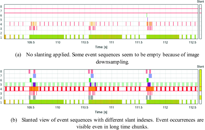
Comparison of the default view and the slanted view of the same set of event sequences in an observation window of 3621 ms.
-
Periodicity anomaly detection. Increasing progressively the slant index allows to detect fine periodicity inconsistencies as depicted in Fig. 9. In this case, it is possible to visually identify an atypical event interval of 13 ms when the standard event periodicity is 12 ms.
Fig. 9. 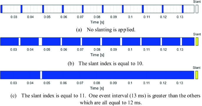
Visual detection of fine periodicity anomalies using slanting.
-
Contextual enhancement. When observing a small event sequence chunk, e.g., with a width of 100 ms, other events can occur before in the past, outside of the observation window. Thus, they are not visible although they might indicate important contextual information. For instance, in a modem trace, a buffer status message containing information about the number of bits to be transmitted might occur before the observed window containing the actual data transmission events. When the buffer status event sequence is slanted, the buffer status message can be visible in the observation window.


3.6 Optimal Slant Index
In the previous subsections, we presented the slant interaction and its usage to support analytical tasks such as periodicity detection or contextual enhancement. This assumes that the user manually performs multiple slant index adjustments in order to find the best slant index for his goal. However, as dozens of event sequences might be displayed simultaneously, slanting every event sequence can take a significant amount of time. Therefore, for each event sequence, we propose to automatically increment the slant index until a stop criteria is satisfied. In essence, we compute the entropy of the slanted event sequence each time we increment the slant index. As the entropy is used to quantify the amount of information in a sequence of symbols, we keep incrementing the slant index of an event sequence until its entropy stops increasing.
Based on the definition given in Subsect. 3.1, we define the entropy of a slanted event sequence \( \left\{ {e\left\langle s \right\rangle_{t} } \right\}_{t = 1}^{T} \) taking values in the set \( {\mathcal{A}} = {\mathcal{H}}\mathop \cup \nolimits \left\{ {\text{NULL}} \right\} \) as follow,
with \( s \) being the slant index, \( N_{a} (s) \) being the number of occurrences of event \( a \in {\mathcal{H}} \) in the event sequence \( \left\{ {e\left\langle s \right\rangle_{t} } \right\}_{t = 1}^{T} \). Basically, the optimal slant index \( s_{max} \) is obtained by solving
We propose to start with \( s = 1 \) and increment this slant index by one until the entropy stops increasing. If the entropy does not stop increasing, we stop the slant index increment procedure until \( \exists a \in {\mathcal{H} }|\text{ }N_{\text{NULL}} \left( s \right) \le N_{a} (s) \). Therefore, given \( \left\{ {e\left\langle s \right\rangle_{t} } \right\}_{t = 1}^{T} \), we only explore the domain \( \left\{ {s | N_{\text{NULL}} \left( s \right) > N_{a} \left( s \right), \forall a \in {\mathcal{H}}} \right\} \) which we call the sparse domain. It can be shown that the function \( s \to H_{e} \left( s \right) \) is concave on the sparse domain of \( \left\{ {e\left\langle s \right\rangle_{t} } \right\}_{t = 1}^{T} \) by proving that the second derivative of a continuous version of \( H_{e} \left( s \right) \) is negative. Therefore, by concavity, the maximum slant index found with our proposed procedure is the global maximum on the sparse domain.
Using this entropy-based slant criteria ensures that a maximum amount of information is presented to the user for each event sequence. In practice, for visualization, we recommend to restrict the exploration domain to slant indexes smaller than \( s_{max}^{viz} \), a maximal visualization slant index such that an isolated event occurrence slanted at this index is represented by only one or two pixels after image downsampling. Essentially, as soon as isolated event occurrences are visible, there is no need to further increase the slant index. Indeed, the more we increase the slant index, the higher the risk is that two isolated event occurrences become visually contiguous, thus losing the information on the absence of event occurrence in between. In Fig. 10, we compare the default view of a trace together with its entropy-based slanted view.

Two different views of a typical modem trace of length 81479 ms containing 21 event sequences. In one click, it is possible to apply the entropy-based slant modification on every event sequence independently in order to magnify the time patterns as depicted in (b) whereas they are less visible without slanting as depicted in (a).
4 Similarity Measure for Subsequence Matching
When exploring an event sequence \( \left\{ {e_{t} } \right\}_{t = 1}^{T} \), subsequence matching consists in finding subsequences similar to a reference pattern \( \left\{ {x_{n} } \right\}_{n = 1}^{N} \). This reference pattern can be a subsequence extracted from \( \left\{ {e_{t} } \right\}_{t = 1}^{T} \) directly or from another event sequence. Subsequence matching is a common task in time-oriented data mining. In particular, for modem traces that typically contain around \( T = 10^{5} \) timestamps, usual data mining tasks often involve subsequence matching with reference patterns containing \( N = 100 \) timestamps. For instance, in order to optimize timers of specific sub-components, e.g., defining the optimal timer duration before entering low power mode, a system engineer would identify a reference pattern \( \left\{ {x_{n} } \right\}_{n = 1}^{N} \) where the timer duration is too long. Based on this observation, the timer duration can be reduced in order to save power. However, this optimization would only have a significant impact if the scenario represented by the reference pattern \( \left\{ {x_{n} } \right\}_{n = 1}^{N} \) is frequent enough along the entire trace. Therefore, quantifying the density of similar patterns in the trace is a crucial step of such analyses.
Although the protocols in mobile communications are well defined, two time patterns representing one specific scenario might be slightly different. For instance, sending one IP packet and receiving its acknowledgment from the server might result in slightly different event sequences for some modem components. Therefore, when evaluating the similarity between time patterns, the similarity metrics usually take into account possible jitters of event occurrences, i.e., the smaller the deviations in time are, the more the time patterns are similar. In essence, a subsequence matching algorithm has a temporal similarity component that takes into account the deviations along the temporal dimension. Additionally, such an algorithm also has a spatial similarity component which takes into account the similarity between values. Essentially, quantifying the spatio-temporal similarity between two sequences can be done by defining a distance between their mathematical representation. In such cases, the similarity is a real scalar quantity which is inversely proportional to the distance.
However, event sequences extracted from modem traces have a particular mathematical representation and classical similarity measures or distances cannot be directly used and require some adaptations. First, as the set \( {\mathcal{A}} = {\mathcal{H}}\mathop \cup \nolimits \left\{ {\text{NULL}} \right\} \) contains the \( {\text{NULL}} \) element, indicating no event occurrence, common distances should be modified as they usually work on sets like \( {\mathbb{R}} \) or \( {\mathbb{C}} \). In our case, the lowest value of similarity should be reached between the \( {\text{NULL}} \) element and every other element in \( {\mathcal{A}} \) including the \( {\text{NULL}} \) element itself. Secondly, modem traces typically contain mixed-type event sequences, e.g., ordinal event sequences (\( {\mathcal{H}} \) is an ordered set) or categorical event sequences (\( {\mathcal{H}} \) is an unordered set). Therefore, in this section, we propose and define a similarity measure that can be applied on two sequences \( \left\{ {x_{n} } \right\}_{n = 1}^{N} \) and \( \left\{ {y_{n} } \right\}_{n = 1}^{N} \) both taking values in \( {\mathcal{A}} = {\mathcal{H}}\mathop \cup \nolimits \left\{ {\text{NULL}} \right\} \) with the set \( {\mathcal{H}} = \left\{ {a_{1} , \ldots , a_{H} } \right\} \subset {\mathbb{R}} \) possibly ordered or not.
4.1 Definition
Given two sequences \( \left\{ {x_{n} } \right\}_{n = 1}^{N} \) and \( \left\{ {y_{n} } \right\}_{n = 1}^{N} \) taking values in \( {\mathcal{A}} = {\mathcal{H}}\mathop \cup \nolimits \left\{ {\text{NULL}} \right\} \) with \( {\mathcal{H}} = \left\{ {a_{1} , \ldots , a_{H} } \right\} \subset {\mathbb{R}} \), we define the discrete signal \( X_{h} [n] \) such that \( \forall n \in \left[\kern-0.15em\left[ {1,N} \right]\kern-0.15em\right] \) and \( \forall h \in \left[\kern-0.15em\left[ {1,H} \right]\kern-0.15em\right] \),
with \( \sigma \) the kernel width. Similarly, we obtain the discrete signal \( Y_{h} \left[ n \right] \). As second step, we perform the convolution of these two discrete signals with a Gaussian of width \( \tau \) and obtain the convolved time series \( \hat{X}_{h} [n] \) and \( \hat{Y}_{h} [n] \). Finally, we define the similarity measure between the two sequences \( \left\{ {x_{n} } \right\}_{n = 1}^{N} \) and \( \left\{ {y_{n} } \right\}_{n = 1}^{N} \) as follow,
4.2 Procedure
In this subsection, we discuss the three key steps involved in the computation of the similarity measure. Essentially, we combine kernel methods and techniques from spike train analysis [8]. First, we propose to map the values to a high-dimensional space to handle non-linear relationships in the data using the kernel trick [9]. Then, as in [10], we compute the correlation of the two high-dimensional signals convolved with a Gaussian filter.
-
1.
Kernel trick. Basically, in Eq. 3, using the radial basis function (RBF) kernel, i.e., \( k\left( {x,y} \right) = { \exp }\left[ { - \left( {x - y} \right)^{2} /\sigma^{2} } \right] \) with \( (x,y) \in {\mathcal{H}}^{2} \), is equivalent to compute the cosine similarity between \( \varphi \left( x \right) \) and \( \varphi \left( y \right) \) where \( \varphi{:}\, x \to \varphi (x) \) is a mapping function into an infinite-dimensional space [9]. It is possible to compute the scalar product \( \left\langle {\varphi \left( x \right),\varphi \left( y \right)} \right\rangle \) needed for the cosine similarity without computing explicitly \( \varphi \left( x \right) \) and \( \varphi \left( y \right) \). This is called the kernel trick. As the kernel width \( \sigma \) sets the level of interaction between the symbols, it is tuned according to the statistical data type. For ordinal values, we set σ in the order of the standard deviation of the symbols in \( {\mathcal{H}} \). However, for categorical values, there is no interaction between symbols as they cannot be ordered and σ is kept very low, typically 1% of the minimum symbol distance. Essentially, in this first step, we quantify the spatial similarity between values in \( {\mathcal{H}} \) and obtain a \( H \)-dimensional real-valued discrete signal without \( {\text{NULL}} \) element.
-
2.
Convolution with Gaussian. In this second step, we set the time scale of interaction for the temporal similarity between two event sequences as described in [10]. Basically, the greater the Gaussian width \( \tau \) is, the lower is the influence of the event occurrence time jitter. In essence, we transform the multi-dimensional discrete signal in order to enable the application of distances typically used on classical real-valued time series.
-
3.
Correlation measure. This last step is described in Eq. 4. For each symbol \( a_{h} \), we compute the correlation between the two convolved signals, \( \hat{X}_{h} [n] \) and \( \hat{Y}_{h} [n] \), and average on the set \( {\mathcal{H}} \). It can be shown that \( 0 \le S\left( {x,y} \right) \le 1 \) and that \( S\left( {x,x} \right) = 1 \). In particular, we have \( S\left( {x,y} \right) \approx 1 \) for similar event sequences, and \( S\left( {x,y} \right) \approx 0 \) for dissimilar event sequences.
In particular, given the two sequences \( \left\{ {x_{n} } \right\}_{n = 1}^{N} \) and \( \left\{ {y_{n} } \right\}_{n = 1}^{N} \), if one of these two sequences is empty, e.g., \( x_{n} = {\text{NULL}} \) for all \( n \) in \( \left[\kern-0.15em\left[ {1,N} \right]\kern-0.15em\right] \), we have the lowest similarity value \( S\left( {x,y} \right) = 0 \). Therefore, our proposed similarity measure implicitly assumes that an event occurrence, i.e., \( x_{n} \ne \) \( {\text{NULL}} \), is always more similar to another event occurrence than to an absence of event occurrence, i.e., \( x_{n} = {\text{NULL}} \).
4.3 Experimental Setup
We propose to compare our approach with two other methods based on classical distance measures, dynamic time warping (DTW) and short time series (STS) distances [11]. Basically, for these two methods, we apply the following procedure. We identically reproduce step 2 and 3 in order to obtain the real-valued time series without \( {\text{NULL}} \) element and then, instead of using the correlation measure (COR) described in step 3, we evaluate the DTW or the STS distance averaged over the \( h \) dimensions.
In order to compare the COR, DTW and STS-based measure, we propose to apply them for a binary classification task. Given a reference pattern \( \left\{ {x_{n} } \right\}_{n = 1}^{N} \), we construct a labelled data set containing both random sequences and sequences similar to \( \left\{ {x_{n} } \right\}_{n = 1}^{N} \), in total \( M \) sequences \( \left\{ {y_{n}^{m} } \right\}_{n = 1}^{N} \) with \( m \in \left[\kern-0.15em\left[ {1,M} \right]\kern-0.15em\right] \). Then, we compute the similarity or distance of each sequence with the reference pattern. Because the DTW and STS-based measures represents positive distances, we apply a strictly decreasing mapping function to obtain the equivalent similarity measure such that the biggest distance corresponds to a similarity of \( 0 \) and the smallest distance to a similarity of \( 1 \). Then, for the three similarity measures, as evaluation metric, we compute the area under the receiver operating characteristics (ROC) curve, or AUC [12]. The AUC has the desirable property to be independent of the mentioned mapping function chosen for the DTW and STS-based similarities.
Given a threshold \( 0 \le \alpha \le 1 \), the sequence \( \left\{ {y_{n}^{m} } \right\}_{n = 1}^{N} \) is considered as similar to the reference pattern \( \left\{ {x_{n} } \right\}_{n = 1}^{N} \) if \( S\left( {x,y^{m} } \right) \ge \alpha \) and dissimilar otherwise. Given \( \alpha \), the true positive rate (TPR) and false positive rate (FPR) are defined as follow,
The ROC curve is defined by the points \( ({\text{FPR}}_{\alpha } ,{\text{TPR}}_{\alpha } ) \) when sweeping \( \alpha \) from \( 0 \) to \( 1 \). The AUC, i.e., the area under this curve, is equal to \( 1 \) for a perfect classifier, \( 0.5 \) for a random classifier and \( 0 \) in the worst case.
4.4 Event Sequence Data Set
In this subsection, we describe the surrogate data sets used for the AUC comparison that we proposed in the previous subsection. First, we generate reference patterns of length \( N = 440 \) with two parameters:
-
Set cardinality, or \( \left| {\mathcal{H}} \right| \). Based on typical modem event sequences, we randomly pick the symbols from sets of different cardinality, \( \left| {\mathcal{H}} \right| \in \{ 2, 5, 10\} \).
-
Occurrence ratio, or \( {\uprho }_{occ} \). We vary the number of event occurrences as a ratio of the pattern length, \( {\uprho }_{occ} \in \{ 1/3, 1/5,1/10\} \).
For each possible combination of \( \left| {\mathcal{H}} \right| \) and \( {\uprho }_{occ} \), we randomly generate 5 reference patterns. Therefore, in total, we have 90 reference patterns with varying set cardinality and occurrence ratio. From each reference pattern, we generate similar event sequences by, first, adding Gaussian distributed jitters with standard deviation \( \sigma_{j} \in \{ 2, 4, 8, 16\} \), secondly, removing randomly \( n_{ - } \in \{ 0, 2, 4, 8, 16\} \) event occurrences and thirdly, adding randomly \( n_{ + } \in \{ 0, 2, 4, 8, 16\} \) event occurrences. In total, with every possible combination of \( \sigma_{j} \), \( n_{ - } \) and \( n_{ + } \), we generate 500 similar sequences for each reference pattern. We extend the data set with 500 dissimilar sequences randomly generated with the parameters \( \left| {\mathcal{H}} \right| \) and \( {\uprho }_{occ} \) as defined previously.
4.5 Results and Discussion
In total, we generate 90 data sets containing 1000 sequences and compute the AUC on each data set using the COR, DTW and STS-based similarity measures as defined in Subsect. 4.3. The Gaussian filter width is chosen in the order of the standard deviation of the jitter, i.e., \( \tau = 6 \).
We compute the AUC averaged on the 90 data sets and obtain \( {\text{AUC}}_{\text{COR}} = 98.6\% \,( \pm 1.4\% ) \) for the COR-based similarity, \( {\text{AUC}}_{\text{DTW}} = 94.7\% \,( \pm 4.5\% ) \) for the DTW-based similarity and \( {\text{AUC}}_{\text{STS}} = 92.2\% \,( \pm 4\% ) \) for the STS-based similarity. From these results, we can observe that the classifier using our proposed COR-based similarity outperforms the other ones on average. Also, we notice that the COR-based classifier has a lower standard deviation and thus, is more reliable than the other ones. In Fig. 11, we depict the ROC curves obtained for one of the data sets.

ROC curves for the COR, DTW and STS-based similarities for one data set generated from one randomly generated reference pattern. The higher the area under the ROC curve is, the better the classifier is. For this data set, the classifier using the COR-based similarity clearly outperforms the classifiers using the DTW-based or the STS-based similarities.
The step 3 of the procedure described in Subsect. 4.2 has a time complexity of \( O(HN) \) for the COR-based similarity, \( O(HN^{2} ) \) for the DTW-based similarity and \( O(HN) \) for the STS-based similarity. Therefore, from a computational complexity point of view, the COR-based approach is also better than the DTW-based approach and equivalent to the STS-based one.
From a human-computer interaction point of view, it is crucial to reduce the similarity computation time while preserving the relevance of the results presented to the user. With a time complexity of \( O(HN) \) and a AUC of 98.6%, our proposed COR-based similarity measure achieves the best complexity-accuracy trade-off.
5 Conclusion
In this paper, we propose three possible optimizations to improve the interactivity of data-centric iterative workflows with an application to modem trace analysis. First, we present a methodology based on persistent memoization of intermediate results in order to reduce the trace processing time during a workflow iteration. We show that up to 84.5% of the event extraction time can be spared for a typical modem trace data set. We make available the source code used to implement persistent memoization in data flow graphsFootnote 1. Secondly, we present the Zoom+Slant visual interaction for exploratory analysis of time-oriented data as an alternative to the classical Overview+Detail and Focus+Context interactions. To increase the amount of information shown to the user, we propose an entropy-based algorithm to automatically adjust the slant index. Finally, we present our proposed correlation-based similarity measure for mixed-type event sequences. For a binary classification task, we obtain an averaged AUC of 98.6% with our proposed measure compared to the 94.7% of the DTW-based similarity and the 92.2% of the STS-based similarity.
We believe that our proposed optimizations can efficiently reduce data processing time, data exploration time and analysis time in order to improve the interactivity of iterative workflows. Finally, we think that further real-life experiments shall be conducted with a representative set of users in order to quantify the overall time reduction. In particular, the mental effort to integrate the Zoom+Slant mechanism shall be evaluated in future studies.
Notes
- 1.
Explore: automatic persistent memoization for compute-intensive experiments, Github repository, https://github.com/jahsue78/explore, last accessed 2019/06/24.
References
Ah Sue, J., Brand, P., Brendel, J., Hasholzner, R., Falk, J., Teich, J.: A predictive dynamic power management for LTE-Advanced mobile devices. In: 2018 IEEE Wireless Communications and Networking Conference (WCNC), pp. 1–6. IEEE (2018)
Dennis, J.: Data flow graphs. In: Padua, D. (ed.) Encyclopedia of Parallel Computing, pp. 512–518. Springer, Boston (2011). https://doi.org/10.1007/978-0-387-09766-4
Guo, P.J., Engler, D.: Using automatic persistent memoization to facilitate data analysis scripting. In: Proceedings of the 2011 International Symposium on Software Testing and Analysis, pp. 287–297. ACM (2011)
Swihart, B.J., Caffo, B., James, B.D., Strand, M., Schwartz, B.S., Punjabi, N.M.: Lasagna plots: a saucy alternative to spaghetti plots. Epidemiology (Cambridge, Mass.) 21(5), 621 (2010)
Aigner, W., Miksch, S., Schumann, H., Tominski, C.: Visualization of Time-Oriented Data. Springer, London (2011). https://doi.org/10.1007/978-0-85729-079-3
Cockburn, A., Karlson, A., Bederson, B.B.: A review of overview+detail, zooming, and focus+context interfaces. ACM Comput. Surv. (CSUR) 41(1), 2 (2009)
Krstajic, M., Bertini, E., Keim, D.: CloudLines: compact display of event episodes in multiple time-series. IEEE Trans. Visual Comput. Graphics 17(12), 2432–2439 (2011)
Brown, E.N., Kass, R.E., Mitra, P.P.: Multiple neural spike train data analysis: state-of-the-art and future challenges. Nat. Neurosci. 7(5), 456 (2004)
Schölkopf, B.: The kernel trick for distances. In: Leen, T.K., Dietterich, T.G., Tresp, V. (eds.) Advances in Neural Information Processing Systems, pp. 301–307. MIT Press, Cambridge (2001)
Schreiber, S., Fellous, J.M., Whitmer, D., Tiesinga, P., Sejnowski, T.J.: A new correlation-based measure of spike timing reliability. Neurocomputing 52, 925–931 (2003)
Zolhavarieh, S., Aghabozorgi, S., Teh, Y.W.: A review of subsequence time series clustering. Sci. World J. (2014)
Bradley, A.P.: The use of the area under the ROC curve in the evaluation of machine learning algorithms. Pattern Recogn. 30(7), 1145–1159 (1997)
Author information
Authors and Affiliations
Corresponding authors
Editor information
Editors and Affiliations
Rights and permissions
Copyright information
© 2019 Springer Nature Switzerland AG
About this paper

Cite this paper
Ah Sue, J., Brand, P., Falk, J., Hasholzner, R., Teich, J. (2019). Optimizing Exploratory Workflows for Embedded Platform Trace Analysis and Its Application to Mobile Devices. In: Stephanidis, C. (eds) HCI International 2019 – Late Breaking Papers. HCII 2019. Lecture Notes in Computer Science(), vol 11786. Springer, Cham. https://doi.org/10.1007/978-3-030-30033-3_10
Download citation
DOI: https://doi.org/10.1007/978-3-030-30033-3_10
Published:
Publisher Name: Springer, Cham
Print ISBN: 978-3-030-30032-6
Online ISBN: 978-3-030-30033-3
eBook Packages: Computer ScienceComputer Science (R0)